Tcos user interface preview
Although most current screenshots found on our website and around the web feature a user interface, we have been hard at work at creating the real ingame version. The new interface has been updated using feedback from the Beta testers. In fact, many of their ideas were very close to the ideas we had been discussing internally! Great minds think alike.
Art of the User Interface
I’ll first take this opportunity to introduce myself - my name is Niel Vredeveldt. I have been working on this project from the very beginning, first as an environmental artist and now as the Interaction Designer here at TCOS. For the ones who are not familiar with the term ‘interaction designer’, it has a lot to do with usability. I try to make the game more user-friendly. As you can imagine, the main tool through which people interact with the game mostly is the User interface. It’s a daunting task to make navigating TCOS a pleasant experience for everyone and creating the actual GUI consumes most of my time. I also work on the movement system, the combat system, player controls and all other combat feedback.
The Spellborn Design Style
Because Spellborn has a distinctive art style, I also try to capture this in the GUI. The easiest way is to achieve this is to use the twirls and bends that are frequently seen in the Spellborn universe, for it makes the GUI rich with detail. There is one downside to this though: the earlier design I have made proved to be heavy on performance (beta 1) and we ended up redoing it all, for playing the game when your machine renders at 5 frames a second did not seem a very good option. You still can see some parts of that design version in the TCOS website layout.
In the current design I have taken a lot of these twirls and bends out of the GUI Design and kept it pretty clean and it improved the performance significantly. I’m still considering adding some more details, and at a later stage probably even more is going to be added, but for now performance comes first. In this picture you can see how the GUI design evolved during the project.

The GUI Window
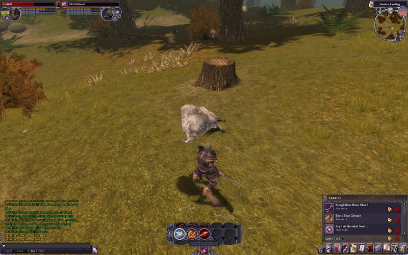
While playing the Chronicles of Spellborn users will see numerous windows. As an example I’ll take one of these windows and explain a little how it all comes together.
Let’s take the inventory as an example. First I will get a request from the Gameplay department that an inventory window is needed. I normally schedule a meeting. In this meeting Gameplay, Interaction design and Tech department representatives will be present. - The Gameplay department writes a functional design and creates a complete outline of what it should do. - Tech department checks if it is possible to create the technology behind this window and will be responsible for the in-game implementation. - Interaction design department (me) comes up with a template design, which shows how it will function; shows where all buttons and information is supposed to be placed. Positioning of this information is crucial for the window to be user-friendly. This normally takes a couple of tries to get it right. In this picture you can see an early template version of the inventory.
For the final design, I use this template to create a mockup in Photoshop. This has to have the same look and feel as the one that will become the in-game version. You can see here a finalized version of the inventory.
